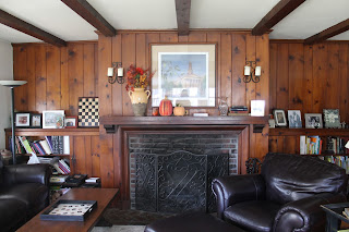
I'm so excited to be posting the design challenge room before and after pictures. Remember this from back in the fall? I went to the house yesterday. I hadn't been back since we had gone over the ideas and options for the room and was so thrilled with the results. During the process we went over all the ideas and I gave them my suggestions with the paint, layout and other ideas to bring the room together. The rug, for example, was a big design element that really inspired the colors in the room. But what was so great is they took all of that and went a step beyond to really add their own touches. They did an amazing job! (you can check here for the original post on the room and see the progress post here).
 |
| before |
 |
after
The room felt a little small and crowded. By moving things around a bit it really opened things up, as you see in the before pictures. and I love what she did with the wall above the sofa. Liz has a great collection of local artwork of scenes from the town she lives in and grouped them together with some different sized mirrors. It now looks so inviting and cozy.
|
 |
| before |
 |
| after |
By flipping the chair with the sofa and armoire, it really balanced out the room and feels so much bigger. The only thing taken out of the room was a smaller chair you see in the first picture above and the small bookshelf that was hidden behind the door. Also as you see Liz painted the armoire. She used Annie Sloan Chalk paint - I think I may have gotten her addicted to it! But it looks great and helped out by lightening up the piece and eliminating another wood colored piece in the room.
As you may remember one of the decisions that she was struggling with was whether to paint all of the wood on the fireplace wall. After talking through things we both decided it would be best to take baby steps. The wood is so beautiful, so as a compromise, they painted the mantle and the brick surround which really makes it pop out now. We talked yesterday and said that a next step could be, if she still feels like it's needed, to paint the bookshelves below. But again it may not be needed with all the changes that were made.
We had discussed ways to bring more light into the room and Liz found this great mirror that looks beautiful and reflects so much light into the room. It made a huge difference. Also notice the panels by the windows that really soften up the room and make it seem so cozy. We talked about the lamp by the window which still needs to be replaced.
before
 |
after
You can really see from these two pictures above how cramped it was in the room before. It was a very tight space in front of the fireplace because of how the chair and ottoman where right in front. Now it is so much more spacious.
|
 |
| after |
 |
after
I love all the pillows Liz picked out and how great they look with the rug and wall color. That pop of the orange is so great with the silvery blue and grays.
|
Here are the touches I love- how great is this dog! And the mercury glass she found to go with her mercury glass lamp is perfect.
This is the piece that was her grandmother's - it's so pretty. The lamp on it still needs to be replaced and possibly the glass vessel below may be turned into a lamp to take it's place. Again the orange color is so great.
I love the fun whimsical details she brought in
Liz found this old bench. We talked about how fun it would be to paint this a shade of orange.
I really like the subtlety of the fabric on the panels. They are just enough to balance out the room with out being overwhelming. Below you see how much the rug really was such a great influence for all the color in the room.
 |
| rug from west elm |
It was such a fun project and Liz was so nice to work with. It's great to hear that the family really enjoys the room and likes spending more time in there. I'm so glad that we did the project and it was great to see the room from start to finish. And again it was inspiring to see how they took the space and really made it their own. Thanks Liz!


