Friday

Final decision for DIY island, three different options


I'm so excited to share my DIY buffet, turned island, step by step. I bought this great buffet before we moved into our house, knowing that I wanted to turn it into an island for our kitchen. Now it is just waiting for the final touch, the top, like the icing on the cake! I have been hemming and hawing over what to use because, not only will this get a lot of use, I also want it to have a little wow factor. So, of course I have been wanting to put a beautiful piece of marble on it. During my search, I have talked to many suppliers and every single one of them said, "why would you want to put marble in your kitchen - it's not practical" etc. etc., but open any magazine and there you will find beautiful kitchens with clean, classic marble counter tops from one end to the next. In my process to find a counter top that I think will match best, with the existing river white granite, I have narrowed it down to three finalists. I have picked my winner, but curious to see what your opinion is on what would look best. But before I show you those, here are the pictures of the transformation.


The back was unfinished, as a buffet would be, so my husband added board and batten elements to mimic some of the detail in our old, built-in kitchen cabinet and our paneling in our foyer. 


He framed it out so it now looks finished. The front of it was already painted in ASCP, with Graphite and then had the dark wax applied over top. Lucky for me I just happened to have both of those so I matched up the back with the front.


I think it turned out really well - it looks like it was meant to be an island! But now for the top- here are my three final choices. As I said I know which one I have decided on, what do you think?


First candidate: carrara marble, I know the cons related to maintenance and care totally outweigh the pros, but it is so beautiful!! But I have to say it has a much whiter background than the existing river white granite that is in the rest of the kitchen. 

Second candidate: organic white Caesar stone. Very uniform, durable and the color does match with the granite better.

Third candidate: Soap stone, again more maintenance and it does wear and patina but in an older home it would be appropriate. I do like the way the gray tones blend with the paint and pulls out the gray tones in the granite.


Ok, what do you think? I will reveal the winner over the weekend and tell you what I had decided to go with, they are dong the install for it next week. Happy Labor Day weekend!

check out  other Feathered Nest Friday ideas over at French Country Cottage
also, Frugal Fridays at the Shabby Nest
and Miss Mustard Seed Furniture Feature Friday

Tuesday

my foyer in a new light {pun totally intended}


My light is finally up! We had to improvise just a little, but at least it is up. We realized that when we started to hang the light that it hung down too low and my husband would hit his head on it every time he walked down the steps. The wires for the light are centered in the foyer but we decided to center a hook in the area of the floor space so it is in line with the doors and centered over the rug. By doing that we had to swing the chain over to the hook, not what I had originally planned but it still works. We have old wiring, which is on our "to do" list to have redone at some point, so to go through the effort to have the junction box moved right now doesn't make too much sense.{although it may be one of those things that just stays the way it is and never gets moved!}


Along with hanging the light, we also added a collection of different pictures, mirrors and antique elements up the staircase which visually changed everything {plus I was so happy to get them off the floor where they were all stacked up!}


These are just a couple of watercolors that I had done years ago and put in frames, I needed some smaller things to fill in  the space below the larger picture above.


I mixed in the different shapes and textures, like this old grate, and yes a picture of Hudson. The weather vanes where kinda neat too, they were broken so I thought they would make better use hanging on the wall. I would still like to find just a couple more things to hang, maybe some smaller round pieces.


Whatever you do, have fun and be creative. It's great to mix in different sizes, textures and elements to create an area of interest.

Monday

beyond white


I have been looking at pictures of kitchen cabinets that go beyond just your basic colors, which has started to motivate me a little to paint my cherry kitchen cabinets at our new house, I'm thinking possibly a lighter gray. Colorful cabinets can look so great. Now don't get me wrong - at our last house we installed off-white, distressed cabinets and mixed them with a black island and a black hutch. I loved it, and was very sad to leave that kitchen after all the work we did!


Painting cabinets is not a fun job, I've done it before and you want to make sure it's done right after you go through all the effort. So while I sit and debate about which color would look best, here are some colorful cabinets options that go beyond white, that would totally change the look of any kitchen.


BHG
BHG

BHG
This Old House


BHG

BHG
House Beautiful
Traditional Home
Traditional Home
Traditional Home
Traditional Home

Friday

repurposed pool stick holder


This has been one of my most favorite repurposed treasures, mostly because if has sentimental value to it, plus it is totally functional. This is an old pool stick holder that belonged to my grandfather, he used to love pool. He would build pool tables in his spare time, and could beat you blind folded!


I was lucky enough to "inherit it" and after having it for awhile I thought why not use it for a coat rack?  I painted it black and got some great hooks from Anthropologie that I put in at the top. We even put a couple in lower for the kids so they could hang up their back  packs and jackets.


My coat rack has become quite a conversational piece, most people don't realize what it is at first glance, until they notice the holes at the bottom where the pool sticks would go.
 It reminds me of my grandfather every time I walk by it and brings back such fond memories!

I've posted this over at French Country Cottage's linky party, at Liz Marie  and  Jennifer Rizzowith a lot of other creative people.

Thursday

ASCP and mahogany

I have usually had great success with all my projects using ASCP, but this one not so much- I wanted to change the look of my rocking chair, new paint, fabric- done!


I knew the rocker was mahogany and I have painted over mahogany before with oil paint and had no problems (I know we really shouldn't paint over mahogany, but....) This time it didn't work so well using chalk paint. I am not quite sure why, but even with 2-3 coats, using ASCP in the old white, the reddish finish of the mahogany started coming through and it is now somewhat pink. Another strange thing it almost starting crackling a bit.


The beauty of the paint is that you really don't have any prep involved, as many as you know. Now with the rocking chair I did wipe it off and very lightly sanded, but I may have missed something here with this one. Curious if those of you who have used ASCP have experienced the same thing with mahogany? Any suggestions on how I could have done anything different? But I still think it is a great improvement over what it looked like. I used  red and white grain sack fabric and have it sitting out on my front porch.


 I'm up for painting and changing most anything, sometimes they come with unpredictable surprises, but it's great to reuse what we have and still feel like you've just gotten a brand new piece!

check out some other great ideas over at The Shabby Nest where I've shared this post on her frugal Friday's

Monday

fleur de lis


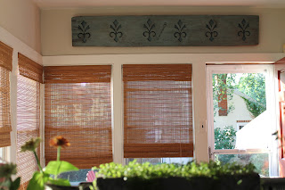
I have been carrying around this huge piece of wood for years - one of those rare architectural finds I was so happy to come across. Years ago I found it at this great antique store, which was filled to the brim with stuff. I had dig through everything just to see what was what. The piece came out of an old barn that was being torn down. It is heavy and it must weigh at least 50lbs, but I somehow convinced my very loving husband to hang it up for me over the weekend. He did it very securely so it would not fall on any one's head and kill them! Not a very easy task.


When I got it, it was just a very dark wood color and I thought it would look great painted so the fleur de lis pattern would stand out better. So I painted it teal and haven't touched it up since. You may recognize it, I've used it on my blog and on other images over the last few years as a kind of logo. It is amazing to see the pictures and how different it looks when you see it on a wall and not just cropped down as an "image".


We hung it  in our sitting room that is just off of our kitchen. We have an old window in the kitchen that looks out into the room and it has made such a difference seeing it out there now hung up. Because it is such a great size, it makes a big presence in the room. I love old architectural pieces, they are really a great find that have such a great history behind them.

Wednesday

My chair reborn in grain sack fabric!


These chairs were my inspiration for my very outdated, in great need of a "face lift" chair.

This is the chair below with a slipcover that I had someone make years ago, very sad! It was a Waverly fabric that I would be happy to never see again, so I was elated to take it off!(I did a previous post on debating what to do with the chair and happy to now show the final pictures!)


Here is the chair without the slipcover, love the blue velvet right?


Well I begged and begged my mother to please try to reupholster it or make a slipcover out of my new favorite, grain sack fabric. After some pleading, she did and I have to say she did an amazing job!!! I painted and lightly distressed the dark wood legs and arms with ASCP in old white, finally showing them off again. I can't take any more credit for the chair, she did all the rest.


I love it!! Looks like a completely new chair and I am in love with the fabric, it is heavier but has such a nice finish. Now maybe I can convince her to tackle my sofa??!

I've posted this on "Feathered Nest Fridays" on French Country Cottage, check out all the other great ideas she has posted on her Friday Linky party! And also over on Jennifer Rizzo's Friday party, and I just came across another great blog where I posted this as well, The Shabby Nest, so many creative people!!

Sunday

making a bold first impression


This Old House

I have been debating what color to paint my front door- it is the first thing people notice when they come to your house, like a first impression and should make a statement. And of course some say that the color you paint your front door has some kind of meaning behind it. Can't we just slap on some paint that looks good without having it mean something? Now I really feel pressured!
Black is said to be powerful, blue is related to abundance, green is said to have balance, purple evokes energy, and red is supposedly welcoming. Whatever color one picks it should also look good with the rest of your house no matter what meaning it has.

Right now my front door is painted black and is in desperate need of a new paint job. I have been staring at doors when I have been walking and driving around trying to see what colors grace the front doors of my neighbors. I have noticed a few lately that have been pumpkin orange - love that.


This Old House


The orange looks great with the gray shingles but I don't think so much with my red brick home, so I have been thinking either a blue or green,.I would love to go bright and add a burst of green, like in the picture below.

This Old House

 But I think I am still stuck on blue. This has always been one of my favorite front doors

via House of Turquoise via Hiya Papaya
I love the Wythe Blue color that was painted on this front door above, but I had wanted to go just a little brighter. I came across this color a couple times, St. Lucia Teal.


via Turquoise Shed

So I decided to just go for it. As you can see, my door seems hidden and dark. It is a really pretty front door and it needs to be shown off.


These were my final choices, Wythe Blue, St. Lucia Teal and Stratton Blue- all Benjamin Moore. I realized after I had picked the St. Lucia Teal that it must have been meant to be. Those of you who saw my earlier post on my new light that will be going in my foyer, it is almost the exact color as St. Lucia Teal.

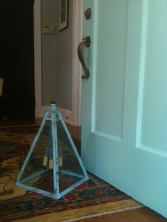
 Anyhow, this is my new door which I love- and you will see how nice it looks with my light sitting on the floor.


As for the light, yes, it is still not hung up. You know the saying measure twice, cut once? (in my case hang once) Well we had a minor problem when we went to go hang it and realized that it needs to be moved over so you don't hit your head on it when you walk down the steps- lesson learned.

When the light is hung up it will be a nice transition from the bright color of the teal door to have the color flow inside and there are also touches of the color in the rug in the foyer as well. The door now stands out and looks fun and bright when you see it from outside. With front doors they aren't a huge commitment to paint so why not try a bright bold color for fun.

HGTV

Website

I finally got my website up and running, really don't know why it took me so long! You can check it out here  Thanks for checking ...